
The Results
The final Cherry on Top brand is playful, nostalgic, and instantly recognizable. It captures the joy of a retro diner while staying fresh and appealing for today’s audiences. The strong visuals help the brand stand out in the dining space and create a fun, memorable customer experience.


The Design Process
Research & Inspiration
I began by exploring vintage diners, neon signage, and playful typography from the 1950s and 60s. These references shaped the retro foundation of the brand.
Sketching & Concept Development
Early sketches experimented with diner style scripts, milkshake imagery, and nostalgic motifs. From there, I refined the direction into something bold yet approachable.
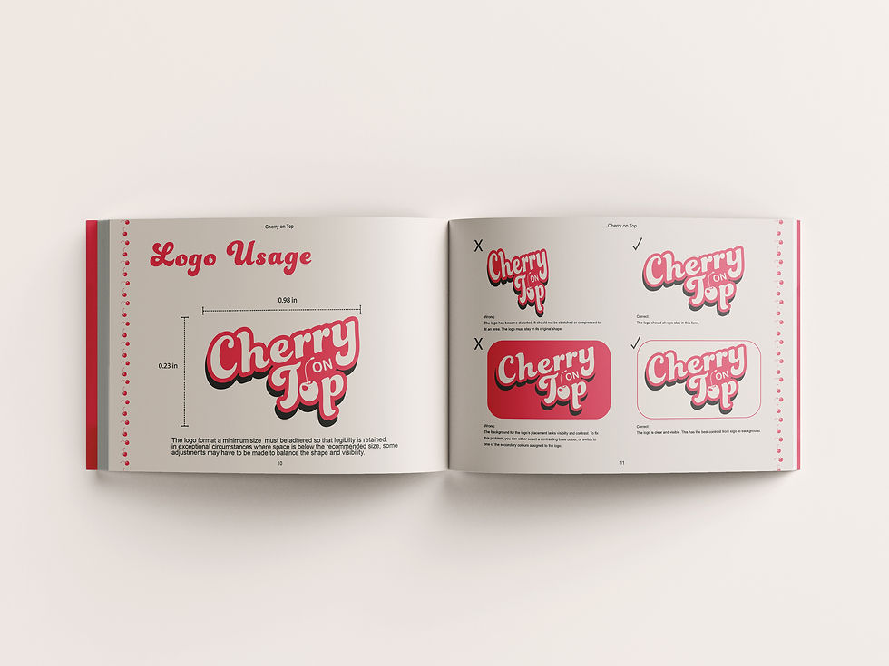
Typography & Logo Design
The final logo combines a chunky, rounded typeface with playful curves. The word “Top” integrates a cherry detail in the “o,” giving the brand its signature mark.

Restaurant Branding
Cherry on Top
Disciplines:
Branding
Menus
Packaging
Software:
Illustrator
Photoshop
Indesign
Designed for a retro-inspired diner concept targeting families, teens, and young adults who love playful, nostalgic dining experiences.
Cherry on Top is a vibrant restaurant brand inspired by the neon energy of classic diners. With bold typography, playful colours, and a nostalgic twist, the brand was designed to create a welcoming space where food feels like a treat and every visit ends on a sweet note.
The challenge was to create a restaurant brand that captured the fun, retro spirit of a classic diner while feeling fresh and modern. The goal was to stand out in a competitive dining market, appeal to a wide audience, and spark excitement through both visuals and brand personality.
The Design Problem


The solution was a bright, nostalgic identity that blends retro diner aesthetics with a playful, modern twist. The bold logo, lively colour palette, and neon-inspired styling were designed to feel welcoming, energetic, and memorable, creating a strong brand presence that customers could instantly connect with.
The Design Solution
Colour Palette
A vibrant palette of cherry red, bubblegum pink, and creamy whites was chosen to reflect both sweetness and energy, while nodding to neon diner lights.
Brand Touchpoints
The brand identity was applied across brand guide, menus, social media, and packaging, ensuring consistency and creating an immersive diner experience.
Key Learnings
This project reinforced the importance of balancing nostalgia with modern design. By leaning into retro diner elements but simplifying and refreshing them, I was able to create a brand that feels timeless yet current. It also showed me how powerful colour and typography can be in setting the tone for an entire dining experience.

© 2025 by Bailey Sullivan. Created on Wix Studio.